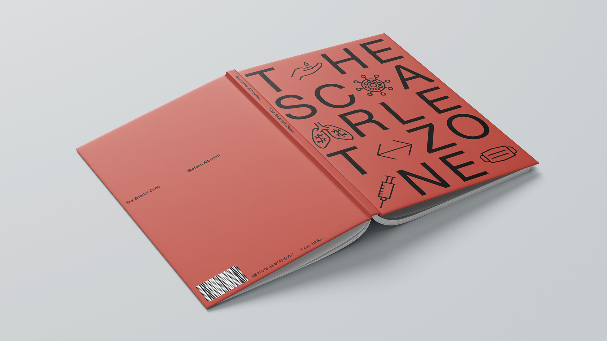
The Scarlet Zone chronicles NYU professor Stefano Albertini’s diary from Italy’s first COVID-19 lockdown “red zone,” raw reflections published with La Voce di New York.
Challenge
Distill pandemic isolation into print without sensationalism needed clean design that amplifies intimate words on fear, hope, and bewilderment from history’s hinge.
Idea
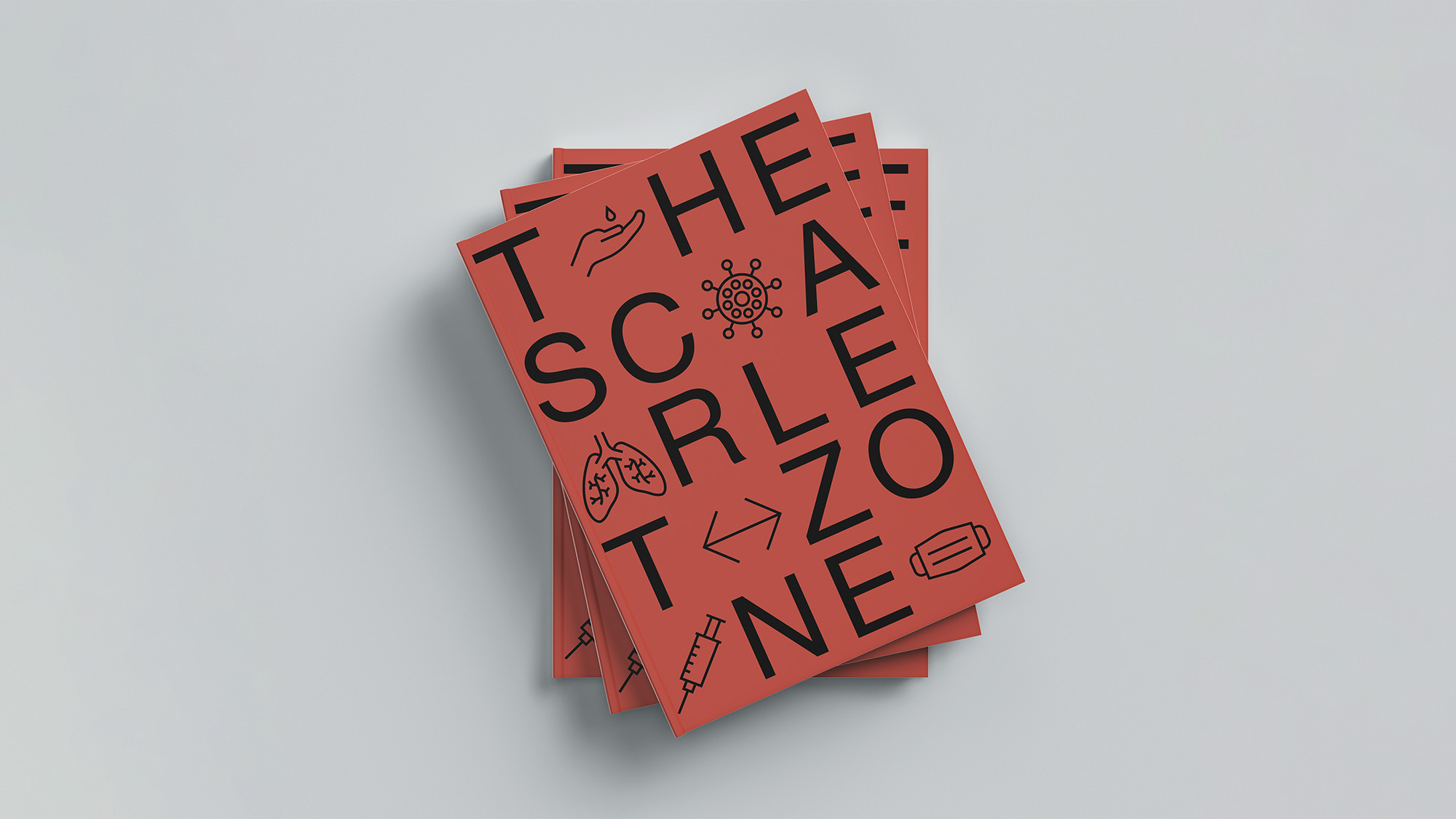
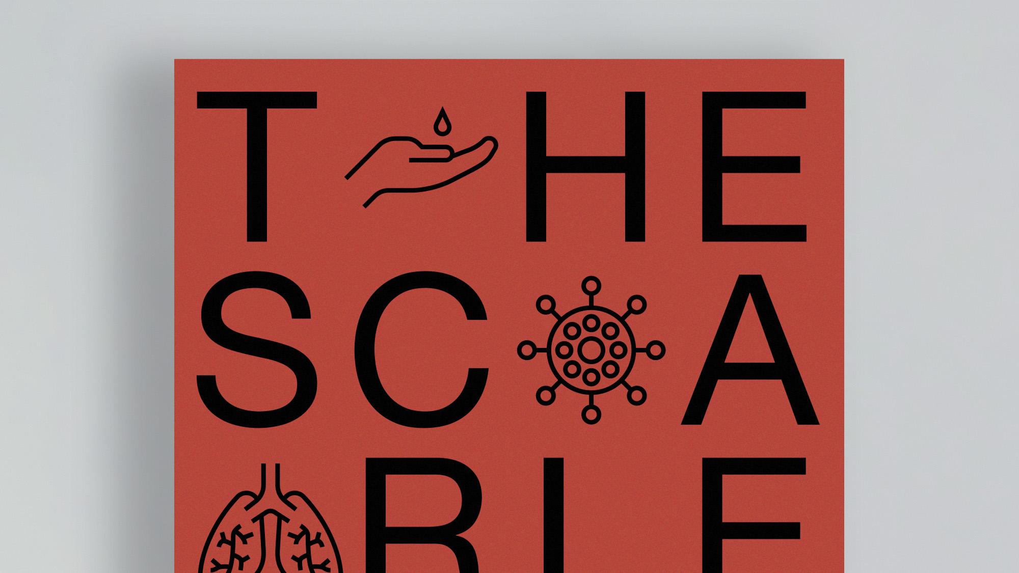
Let words lead: bold red cover embeds subtle COVID icons into title letters, setting somber tone while interior simplicity spotlights the diary’s emotional arc unadorned.
Solution
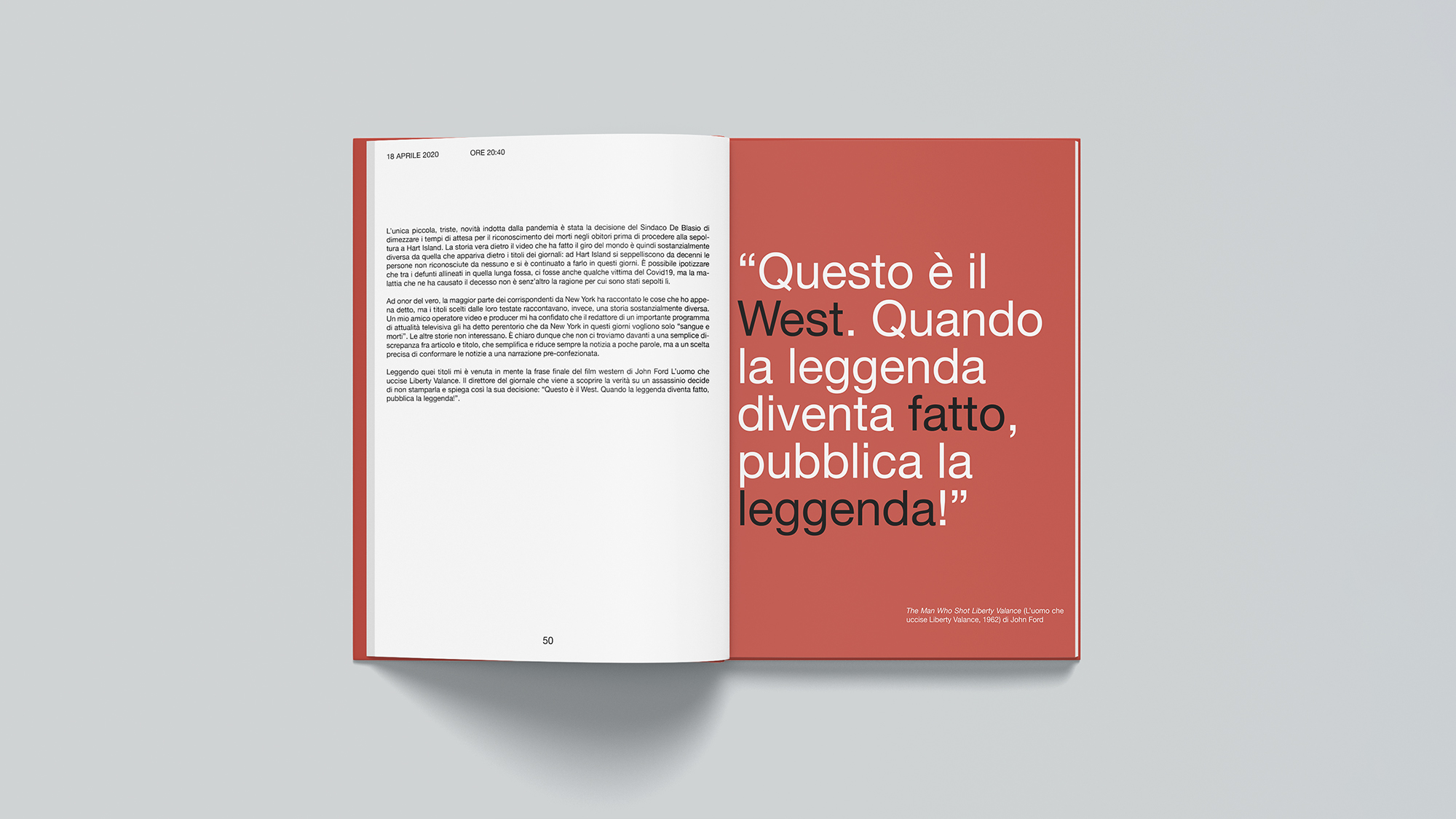
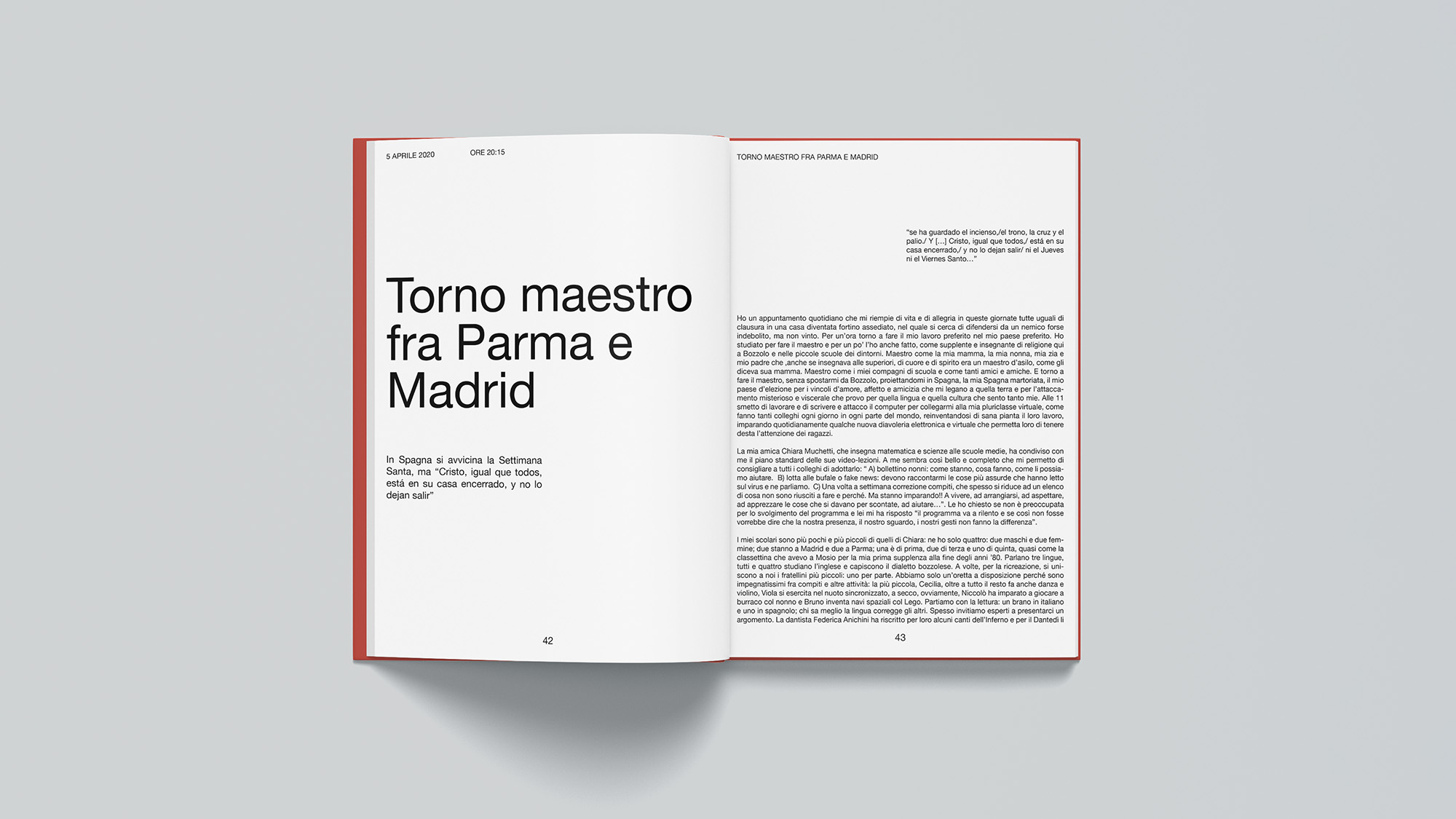
Dominant red palette evokes the zone; title typography boldly integrates mask/virus motifs as negative space, drawing eyes without overwhelming. Clean, minimal interiors prioritize generous white space, scannable sans for dates, and subtle serif for narrative flow, ensuring every page breathes contemplation. Full system honors raw humanity over graphic noise.
Impact
Readers dive straight into Albertini’s voice; design fades so the lockdown’s hope amid horror resonates deeply, making history personal and unflinching.