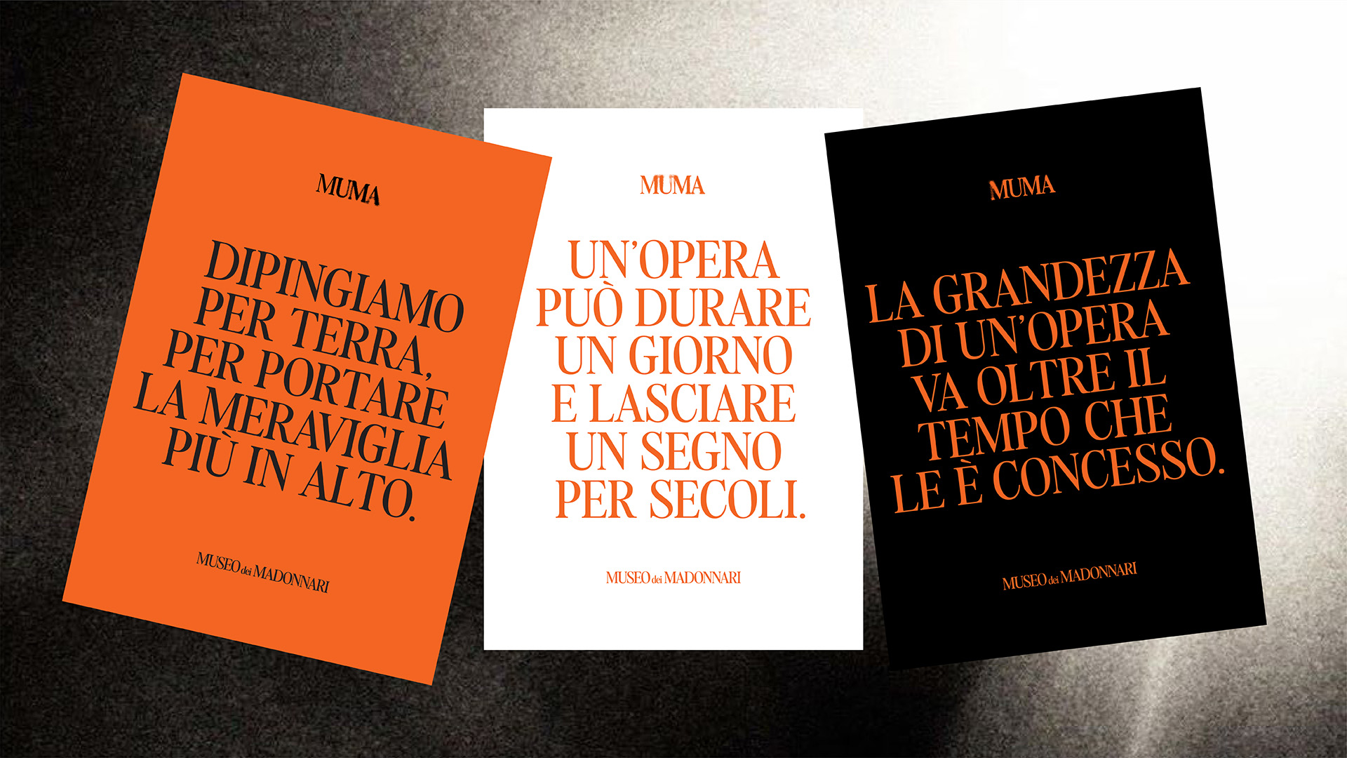
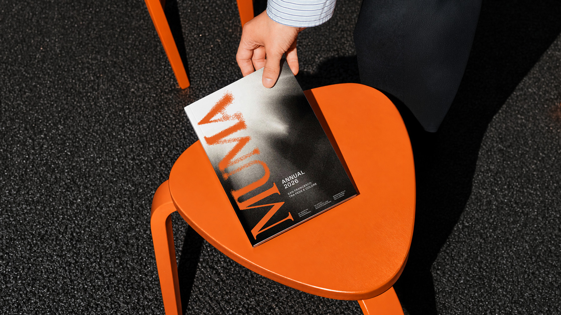
The project explores how imperfection, repetition and fading can become part of a recognizable visual language.
Challenge
Representing an art form that doesn’t last.
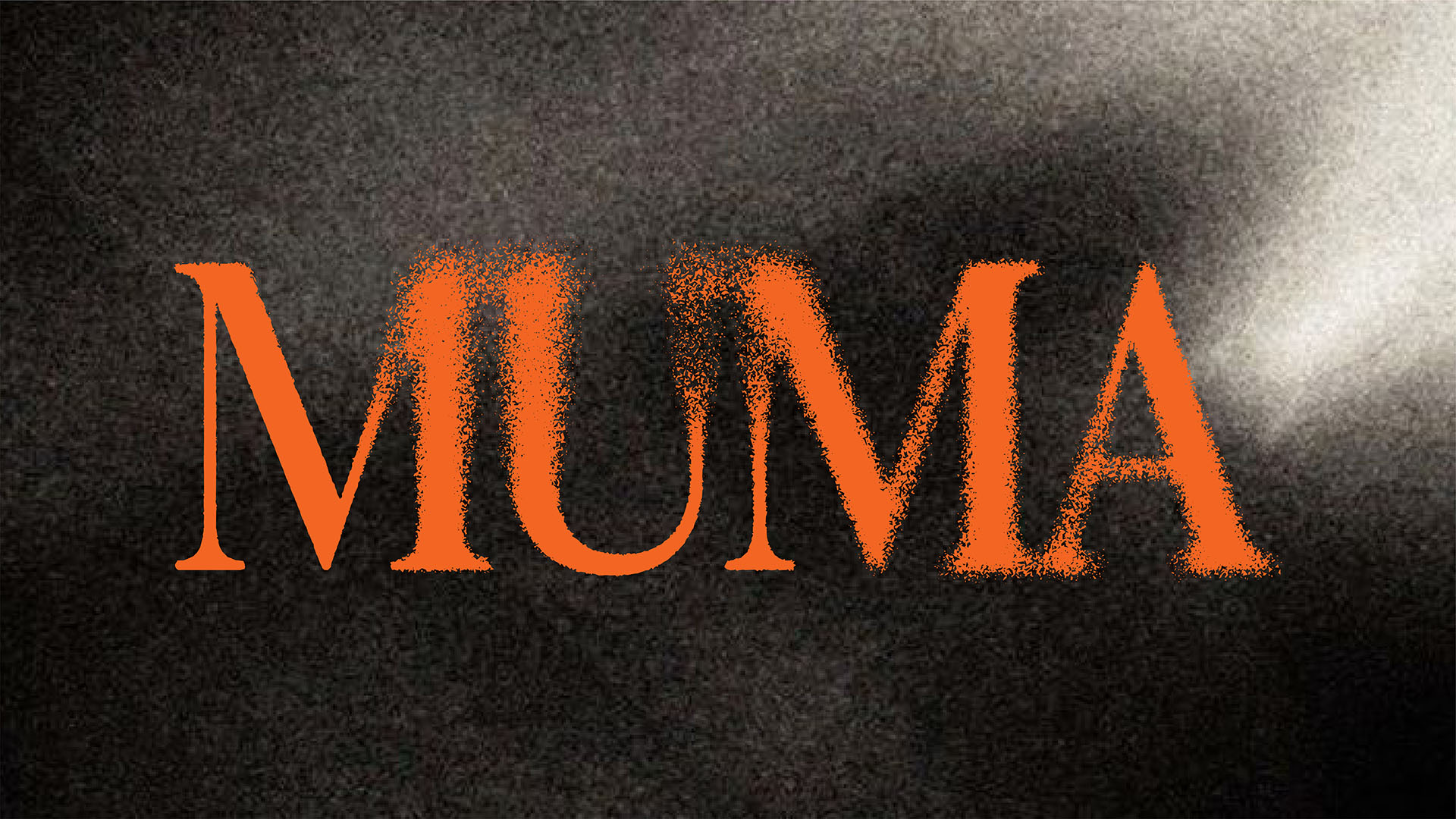
MUMA is a museum dedicated to Madonnari, artists who create large-scale chalk paintings directly on the pavement. Unlike traditional paintings, their works are temporary. Rain, footsteps and everyday street activity gradually erase them, sometimes within just a few days. The challenge was to develop a contemporary identity that could represent both the artistic value of this tradition and the temporary nature of the works themselves.
Idea
The same gesture, never the same result.
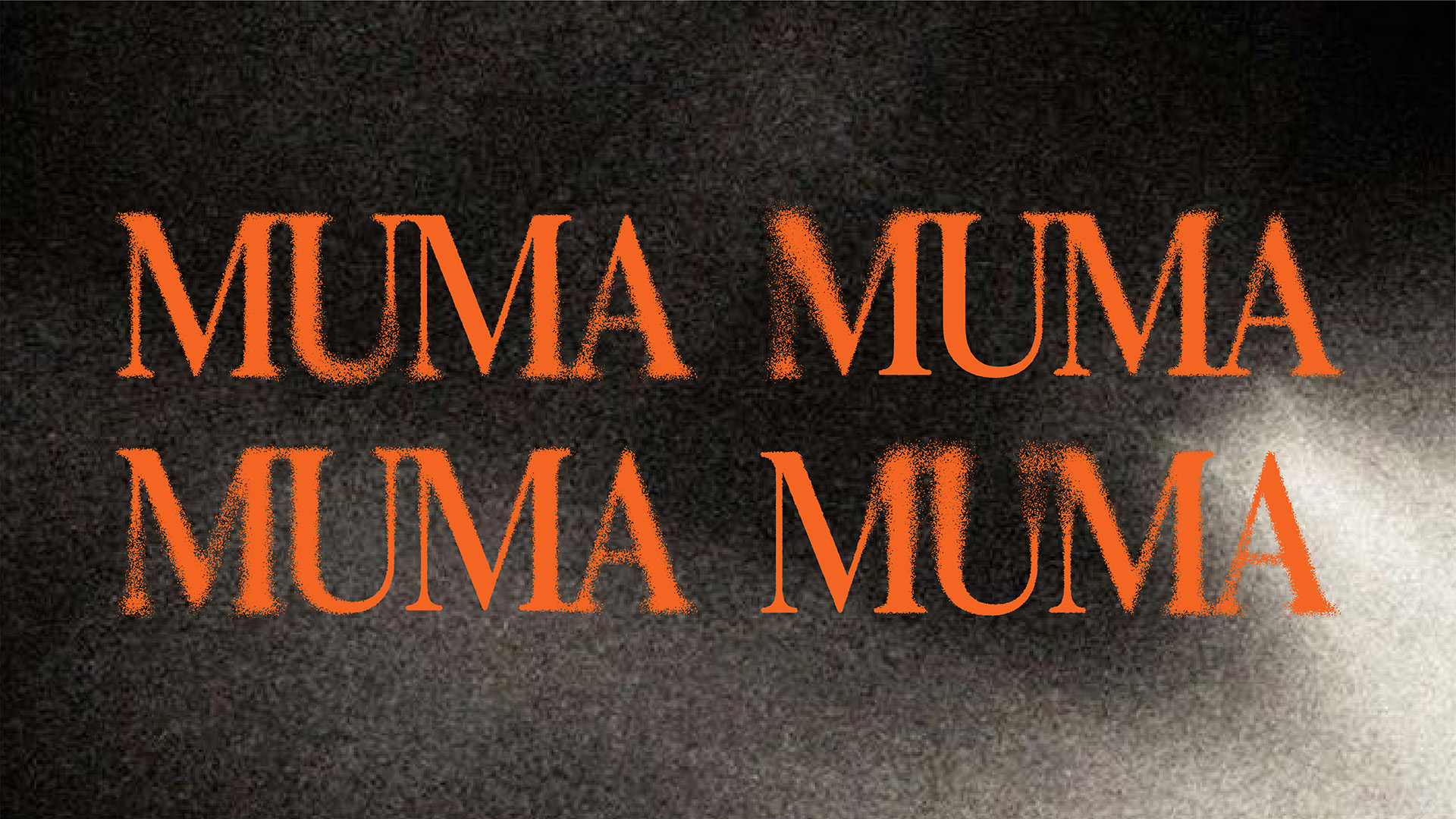
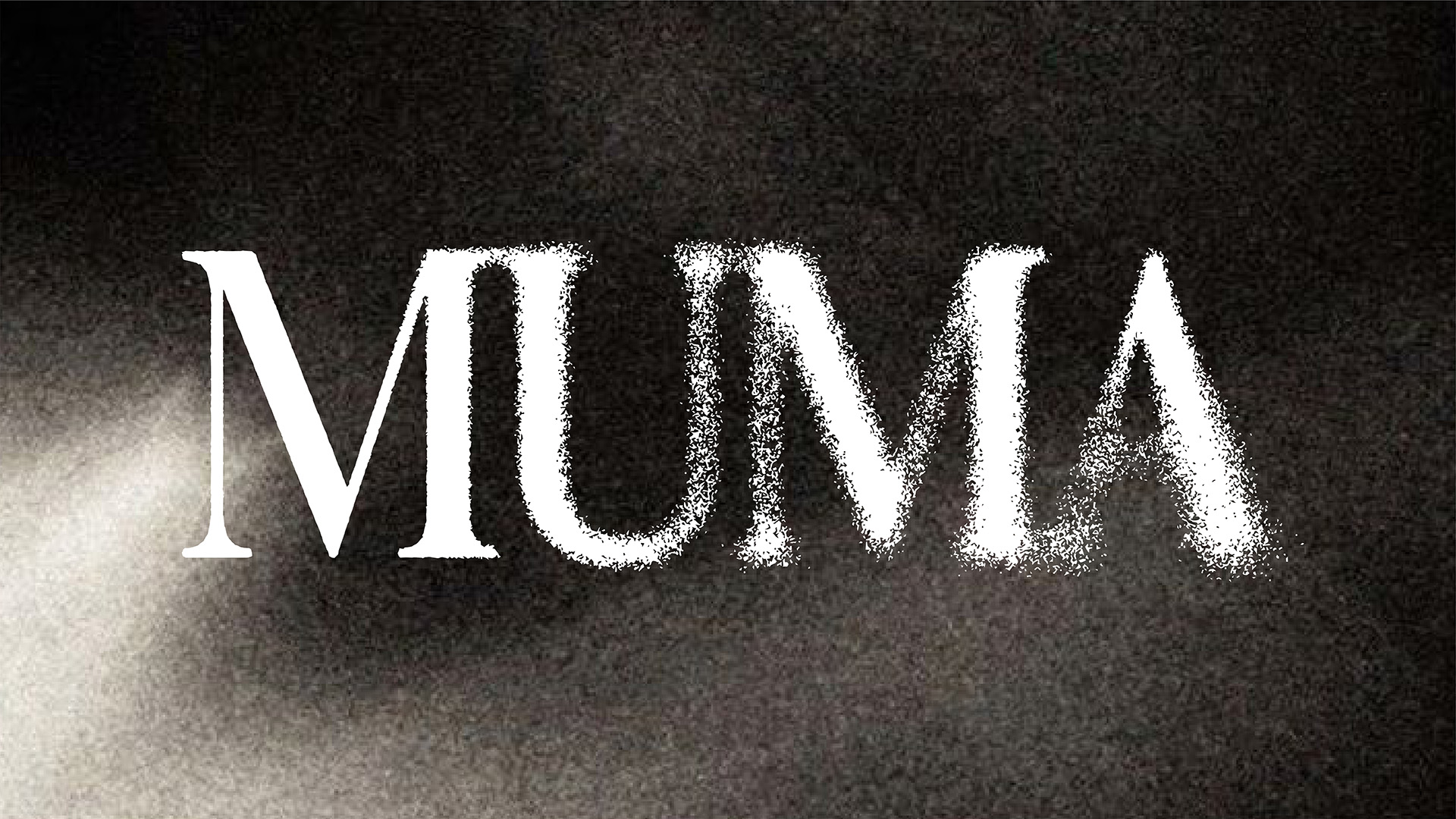
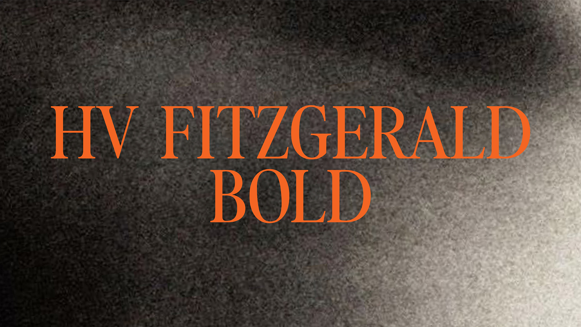
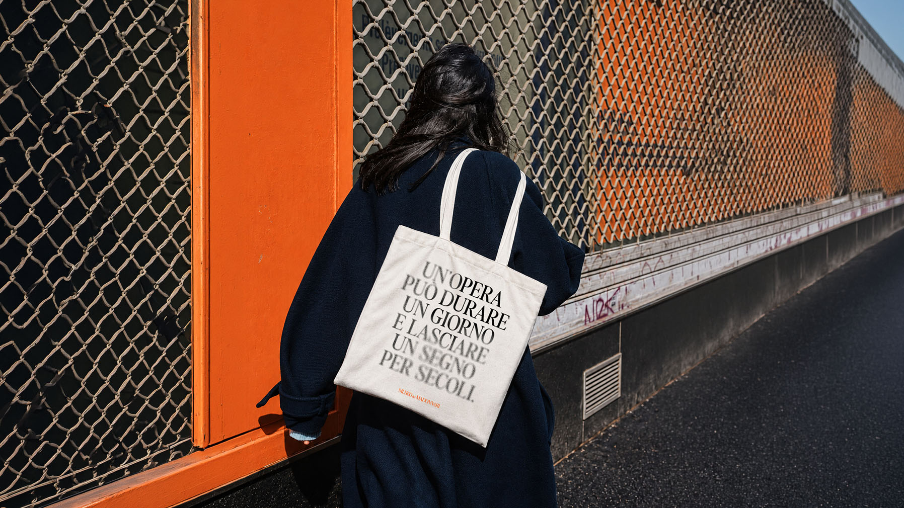
The concept starts from the way chalk behaves on a surface. Every stroke is slightly different, its edges are irregular, and the pigment gradually wears away. We applied these characteristics to the museum’s logo, starting with an elegant, precise serif typeface and introducing chalk-like textures that alter its original shape. The result is not one fixed logo, but a series of subtle variations. Some letters remain clearly defined, while others appear partially erased. Each version is different, just as every chalk drawing is unique.
Solution
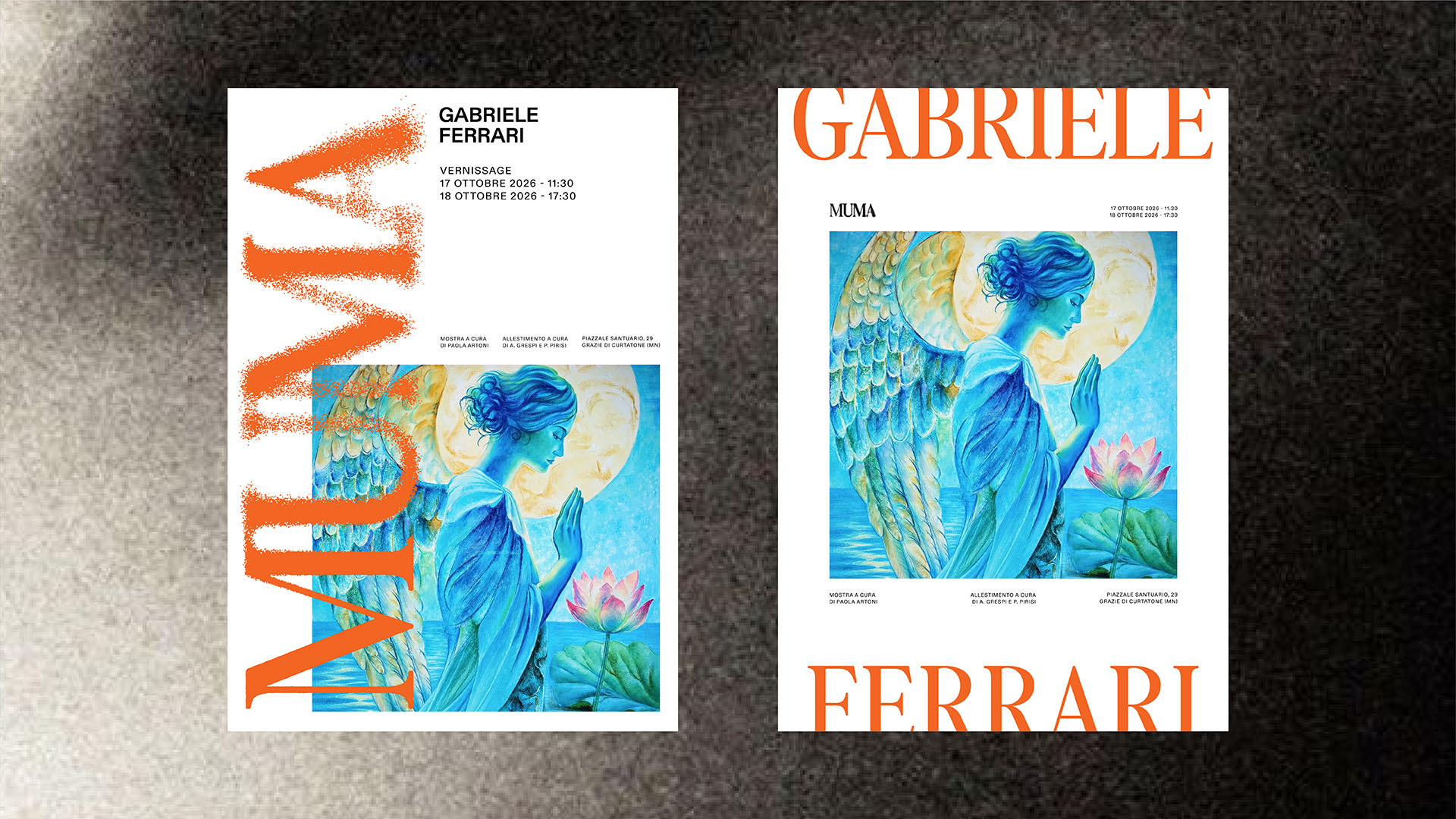
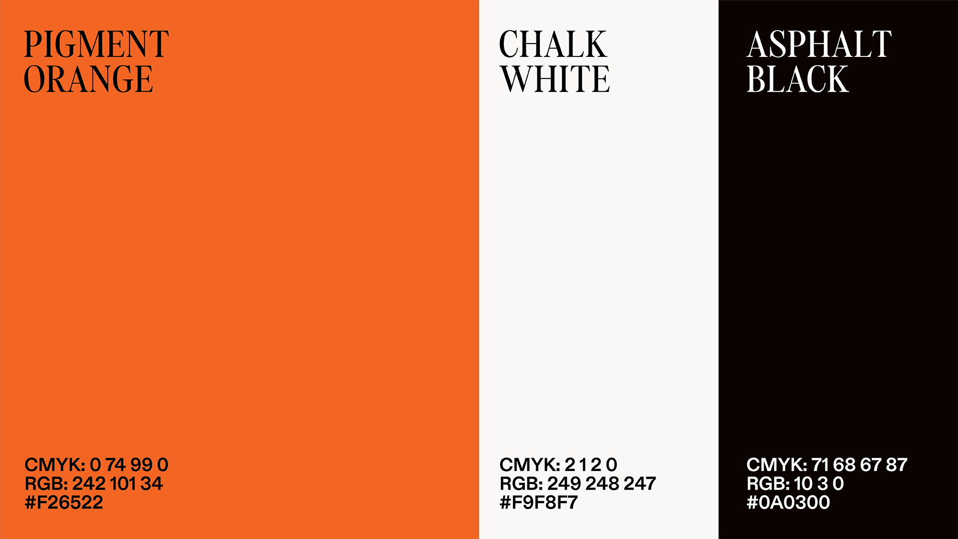
The project gives MUMA a visual language directly connected to the art it represents, without relying on traditional museum graphics or decorative references to historical paintings. The variations in the logo and the use of fading typography become distinctive elements that can be used consistently across the museum’s communication. The result is a flexible identity that reflects how Madonnari work, while giving the museum a contemporary and consistent visual presence.
Impact
The rebrand gives Pizzedda a coherent identity built around its most distinctive product quality. From a takeaway box to a social post, every application connects back to the same name, shapes, and sensation, creating a foundation for recognition and a broader lifestyle positioning.